January 2014 Archives
2014-01-30 21:58:31
Inflation adjusted Dow
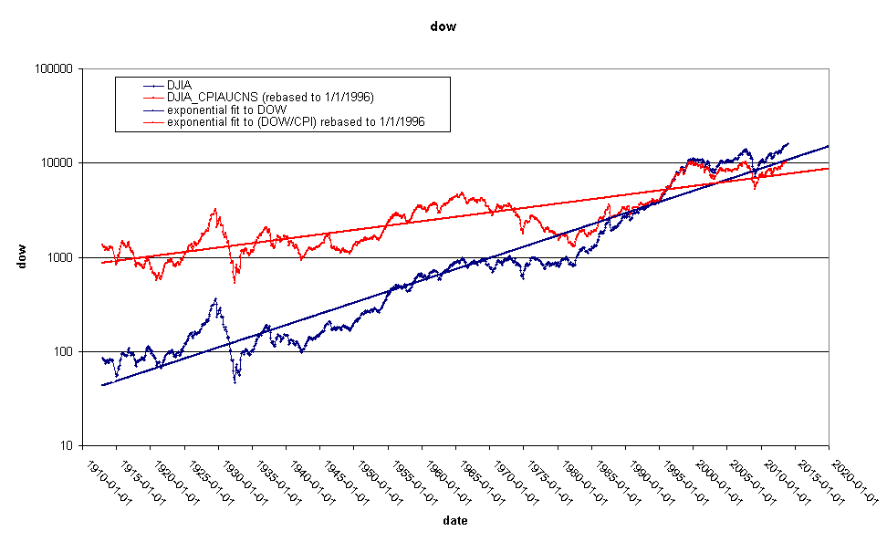
Note that I am using the Dow not the S&P500 I used on 2014-01-26. This series is quite a bit longer than the previous one. The longest Consumer Price Index record I can find dates back to 1913. Both series are above their long term trend line. The percentage above long term trend line is here:
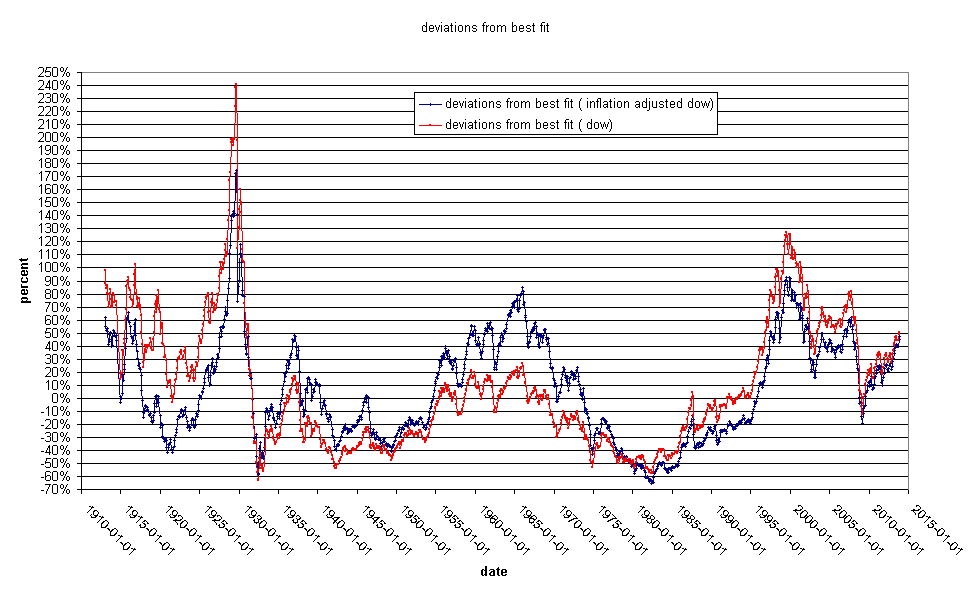
The take home message here is that the Dow is overvalued relative to things that people need to buy, such as food and energy. Not surprisingly, commodities such as wheat and pork bellies are reflecting this. The Dow is very high, but it has not hit it's recent highs relative to it's long term trend line. interestingly, it's rate of increase relative to the run up from 1995-2000 is much slower. The thing that distinguishes a best fit line, is that the data spend half of the time below the line and half above. We need some serious below-the-line time to keep this line running straight.
2014-01-26 01:13:28
Fair value for the S and P 500
This is How Tops Are Made
An article detailing many of the concerns I have about the future of the economy and ending like this:
Eventually you have to sell products and services to consumers at a profit. The higher your "P" for a given amount of purchasing power the consumer has the more leverage you have to results on both sides, and this means that when the right person sticks up their hand and calls bull**** you're going to see 50% declines or more in price before you can reach for the mouse.
Count on it
Just because I think that debt levels in virtually every corner of the globe are too high and Price/Earnings levels are elevated doesn't mean that we will have a stock market collapse. Markets are frequently irrational. This bull market might continue for quite a while. This is a chart of the S & P 500 back to 1955:
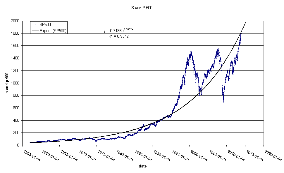
Note that we are exactly at fair value.
Denninger was running a "DefCon" style light pole on his site some time ago. He had it at condition red for a while and eventually moved to "defcon 1" before removing the thing altogether. No explanation or apology, it just disappeared one day. Suffice it to say, I take his warnings with a grain of salt.
2014-01-15 14:17:49
Fiat Money Quantity
In this paper Alasdair Macleod introduces a concept he calls Fiat Money Quantity. He considers this to be a better measure of the quantity of money outstanding. Monetarists subscribe to the quantity theory of money, that holds that the quantity of money in circulation is directly proportional to the general price level. I have charted the Fiat Money Quantity (FMQ) as defined in his paper:
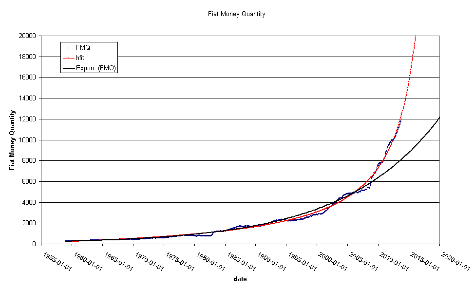
Things to note here are:
The exponential fit to the FMQ. This demonstrates that FMQ is going up at a rate greater than exponential. This means that the FMQ exceeds the natural rate of increase you would expect to see from population increase.
A popular idea in the alternative economics sphere is that present government policies will lead to hyperinflation. This idea is at odds with current thinking about why hyperinflations develop. Generally hyperinflation is the result of a small politically isolated nation losing a war or having a revolution or similar setback. I'm fond of bold projections, and this one is pretty fun. See the red line? It is a hyperbolic fit to the FMQ data. The rectangular hyperbola is a function that goes to infinity ( i.e. like a hyperinflation) and it happens to fit the FMQ data to a Tee. The rectangular hyperbola has an amusing quality that you can actually tell the exact date that it becomes infinite. In this case that date is 2020-7-2
2014-01-12 22:23:37
10 year treasury and polynomial fit
You are probably asking yourself, " Arlequin, Why would you review your Nobel Prize winning work on the 10 year treasury bond? Haven't you already said everything there is to say about it?". I need you to forget everything I said about the 10 year bond. This is a new and Ahem... correct... analysis of the US treasury market.
This is a the same chart I showed on 2014-01-08 but I have added a quadratic fit to the data and highlighted the Federal reserve chairman that was in power during each period.
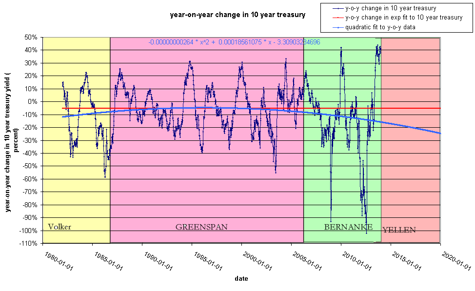
What we see here is that each Fed chairman had a characteristic policy with regards to treasury yields. Volker reduced them aggressively, Greenspan reduced them gradually and Bernanke has been the most aggressive in accelerating the downward trend in yields.
What would the blue curve look like on the simple time series chart? Mathematically this is a little complex, but the answer is here:
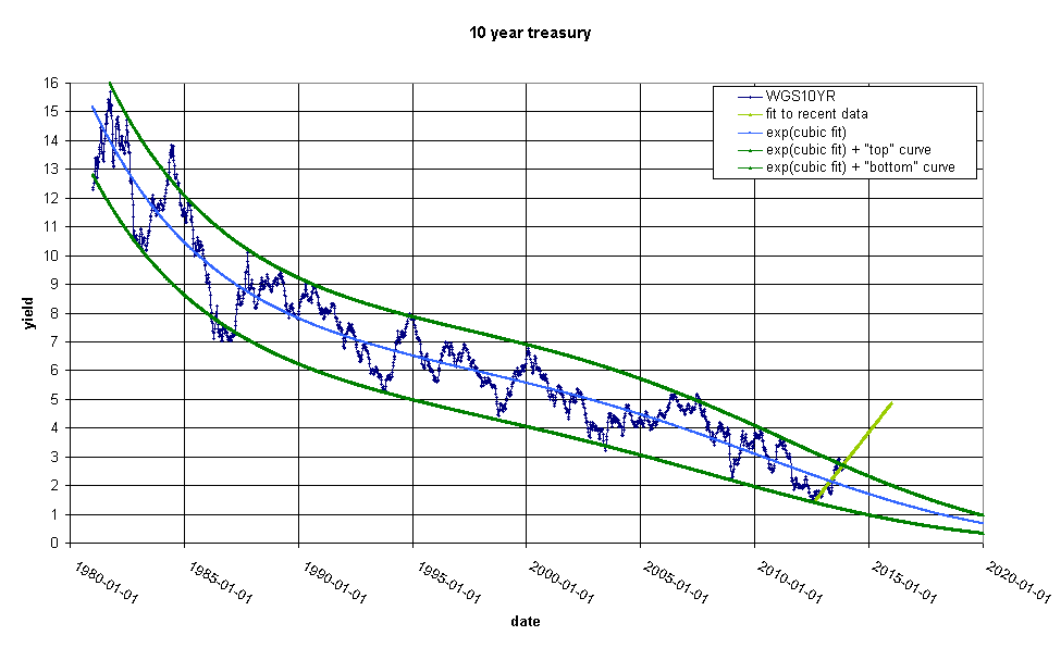
constructing the blue line immediately demands what the deviation chart would look like:
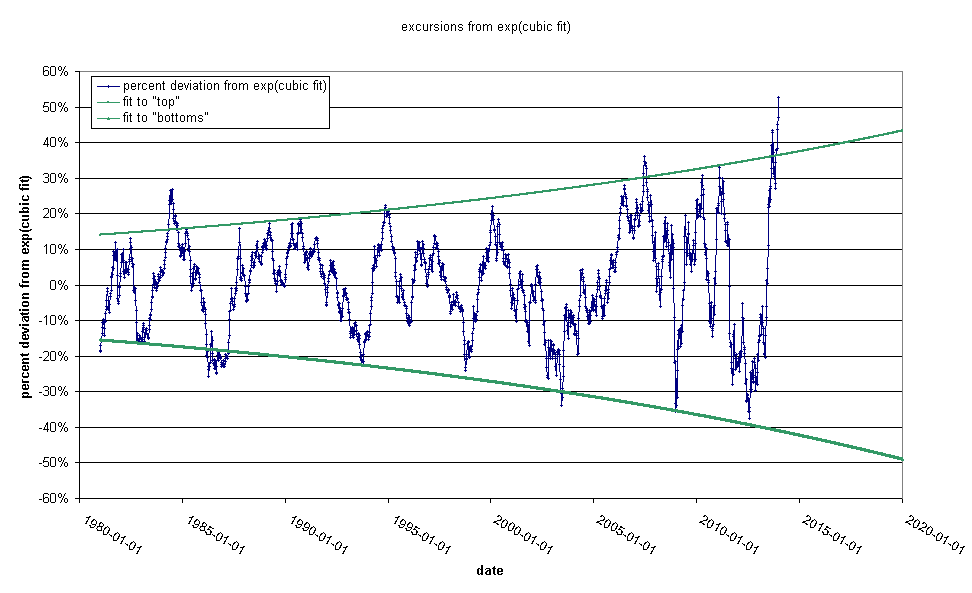
note that in contrast to my chart on on 2013-12-29 we have already long passed the point at which the Fed has generally intervened in the bond markets in the past and we are sailing upwards to the magic 70% crisis level. Note that although the Fed target has been exceeded before, it has never been by so much. I expect a violent downdraft in rates soon.
This post represents a departure for me. I generally try to make
charts that embody simple, obvious mathematical relationships that
are intuitively appealing. This is a bit more complex. I am doing
this because I think that the Fed target rate for interest rates is
not widely understood outside of the Wall-Street community. Far
from being an original observation of mine, I think this result is
generally understood by stock brokers. "Everybody" knows that
we are at crisis levels and "everybody" is expecting a slam down.
If it doesn't come soon, Yellen will lose all
credibility.
2014-01-08 16:41:04
Year-on-Year changes in 10 year treasury yield
This is a fairly busy chart showing the relationship I talked about on 2013-12-29:
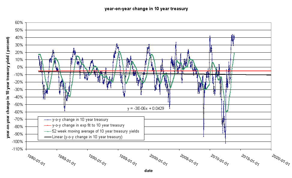
The 10 year US treasury yield is dropping at a relatively fixed rate every year. The target percentage drop is 5%/year. This requires a little interpretation. If the yield on Jan 1 is 4% a 5% drop would take you to 3.8% on Dec 31. Note that the fitted line shows that the fed is not keeping to the 5%/year plan. We are currently flirting with 10%/year and the fluctuations ( as I previously discussed) are getting bigger.
2014-01-07 21:55:26
Dow:Gold vs. Gold:Dow ratio
Following on from my post on 2014-1-1 entitled:
The Dow/Gold Ratio, I read the following article on
CaseyResaerch:
The Correction Isn't Over, But Gold's Headed to $20,000. In the
article, Professor Krassimir Petrov points out that it is possible
to draw a line from the low point in 1932 to the low point in 1980
on this chart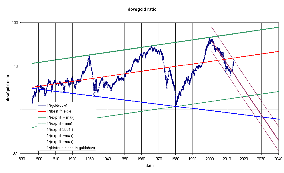
I have added his proposed line and extended out the exponential fits to recent data to an intersection in 2026 to 2037. I should point out that he says that technical analysis doesn't work with long term cycles. This chart has gained a lot of notoriety since James Turk promoted it in an article in Barron's some years ago. Let's look at the inverse of the chart, the Gold/Dow ratio:
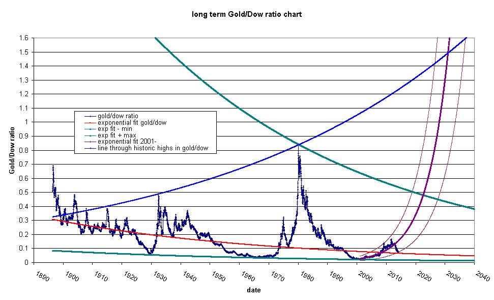
this chart speaks to me more than the inverted chart. It looks to me like we are closer to the beginning of a move in gold than to an end. You don't have to belive the Krassimir Petrov line in order to see a significant move in gold coming.
2014-01-02 22:17:01
On prediction
Let's talk about prediction. The internet is overflowing with prognosticators who get paid to have opinions on anything and everything. "Unemployment is going up .25 percent!" "IBM will hit 190 tomorrow!" "The Euro is going down!" They don't care if they are wrong because people will soon forget about their latest prediction and move on. This is not that kind of blog. I want to write my thoughts without the strictures of prediction. If I make a prediction, I want it to be right. I admire Yves Smith, who NEVER makes a prediction. I don't have the self control to never make predictions, but I can limit the number of predictions I make. Most of all, I want people to understand that I am making simple and short term projections of long running trends. If I draw a line on a chart it is a projection of a trend not a prediction. So with that said, I want to introduce a chart I left out of my post on the 28th of Dec. 2013.
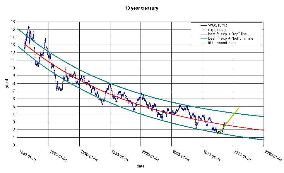
I do not believe in this lime green line. I think the Fed will do something before the bond markets get out of control. I don't know what that something would be. I might speculate about a new currency or a revaluation or something, but I cannot tell how serious a bond market dislocation would be.
2014-01-01 21:44:28
The Dow/Gold Ratio
Today we are going to do the Dow/Gold ratio. It is a technique for abstracting out the currency you are using to find true value. This is the Dow/Gold ratio chart:
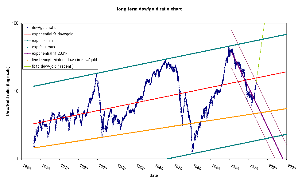
This is weekly average data on gold and the Dow Jones industrial average. The red line is an exponential fit to the data. The dark green lines are parallel and pass through respectively, the max and min deviation in percentage terms from the red line. The orange line is an interesting straight line through some of the historic lows in the chart (but not through the all time low in 1980). I have also highlighted some recent action with the lime green and purple lines.
Note how, in general, stocks seem to be moving upwards relative to gold over a century long period. This happened even when the US was on the gold standard (up until 1933). In addition it is worth noting that the tops of those big bumps form a nice straight line. There is a tiny gap between the green line and the tops of the last two bumps. You can see it more clearly here:
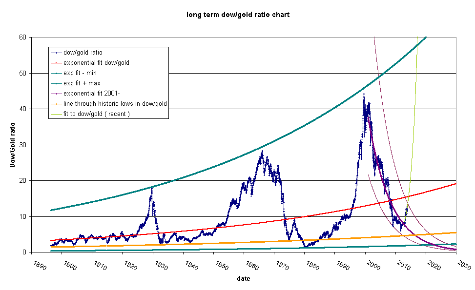
This indicates that the red line is pointing up too high about one or two degrees. Keep this in mind when we look at the short term moves.
Now let's look at the short term:
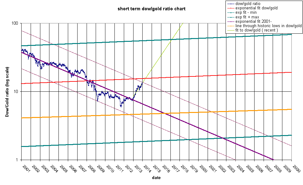
What do we see here? The Dow/Gold ratio will hit the red line in April-May 2014 time frame. It might or might not bounce. If it fails to bounce at the red line, it will continue on to the top line and most likely will bounce in 2017. The purple line is looking very good still and I expect a bounce in April 2014. The bottom will be between 2019 and 2027 with a most likely bottom in 2022 at a ratio of 2 or so. Another possibility is that the bottom happens at the orange line between 2016 and 2021 at a ratio of about 4.6-5.0
Same view with a linear scale:
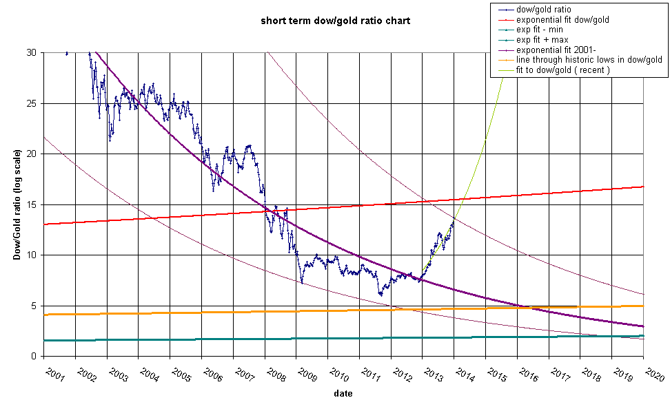
The lime green line hits the red line at a ratio of ~15.9 or if gold hits 1050 we will see a Dow of 16700. If gold stays near 1200 we would see a Dow of 19080. In light of the fact that the new Fed chairwoman will be seated at that time, I foresee a market crash and a more likely scenario is 14,000 Dow and $880/oz gold. This would be a roughly 50% retrace of gold and represent a capitulation.
Bear in mind that the red line is a tad too high. If we assume that the intersection of the lime green line and the red line should be at about a ratio of 15, then it will most likely happen in February 2014. This is coincidentally when Janette Yellen takes the helm of the most powerful bank in the world.
Bon Voyage!