December 2013 Archives
2013-12-29 21:45:15
More on 10 year treasury curve fitting
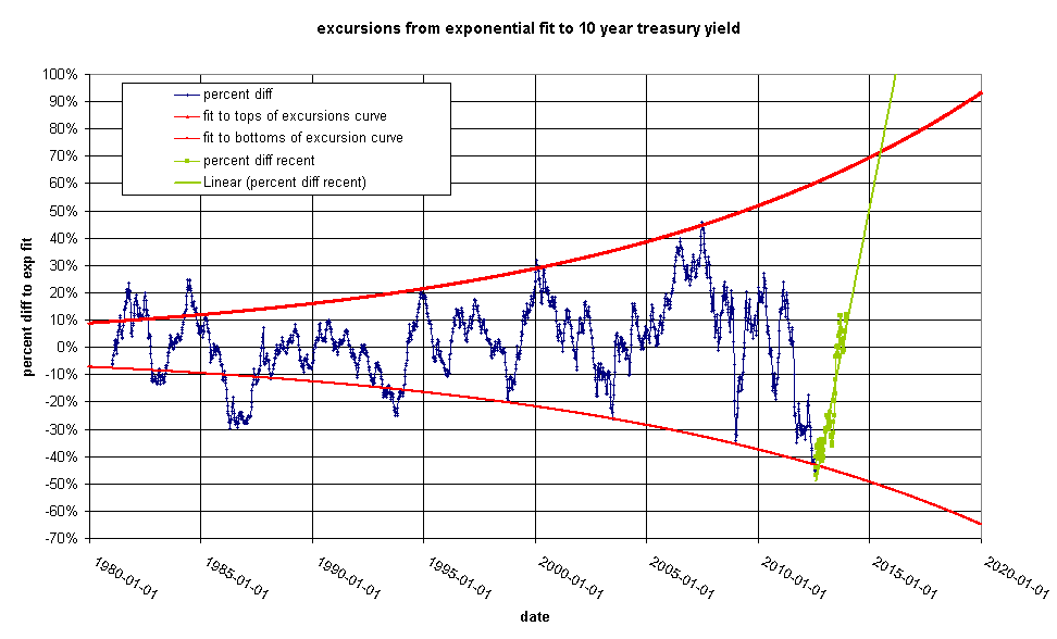
Yesterday I introduced the 10 year treasury curve fit. This is the same chart with a log scale to help show how I constructed the green line in the original chart. Note that the green lines are parallel to the red line, but displaced to pass through the highest and lowest points on the blue curve.

This technique shows the maximum excursions from the red line that have been obtained to date, but doesn't do much for prediction. Let's look again at the excursion chart:

I have added exponential fits to the top and bottom points since about 1994 and extended them out to 2020. I have also highlighted recent movements in green and added a trend-line. The green line intersects the top red line in mid-2015. The excursion would then be about 70%. This is what the original chart would look like with the red lines from above substituted for the green lines:

Take a moment to reassure yourself that this curve accurately represents the recent past. If the upper red line in chart two can be believed, the yield in mid 2015 would be about 4.1%.
What does this mean? It means that the Federal Reserve will have lost control of the 10 year treasury yield. It looks to me like the Fed has been maintaining a glide path for treasuries where yields drop by a fixed percentage each year, but it is getting harder and harder to keep them on track. When yields get too low, they give them a whack. When they get too high, they give them a whack in the other direction. But this is a losing battle. They are seeing greater and greater moves away from the red line and they will soon not be able to control yields at all. A yield of 4.1% in 2015 would mean that the 10 year is 70% off from it's target. Effectively the Fed will be saying it cannot control the bond market anymore. This would be the end of a organized bond market.
2013-12-28 14:15:31
10 year treasury yield
Fitting a curve to the 10 year
treasury yield gives some interesting results.
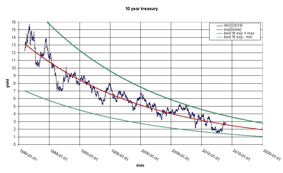
This is an exponential fit to the 10 year treasury yield since 1982. The red line is an exponential fit to the data and the green lines are exponentials that pass through the maximum or minimum points on the blue curve relative to the red line. Note that the size of the excursions from the red line are increasing. This curve quantifies the difference:
For purposes of argument, let's suppose that we see a 50% upswing by 1-Jan-2015. This would be a value of 3.675%/year. Today this doesn't look like a huge jump. We are looking at 3% on the nose as of Friday 27-Dec-2013, but in fact due to the fact that the green lines are converging, this is a dramatic departure from previous behavior.