10 year treasury yield
Fitting a curve to the 10 year treasury yield gives some
interesting results.
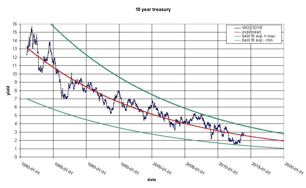
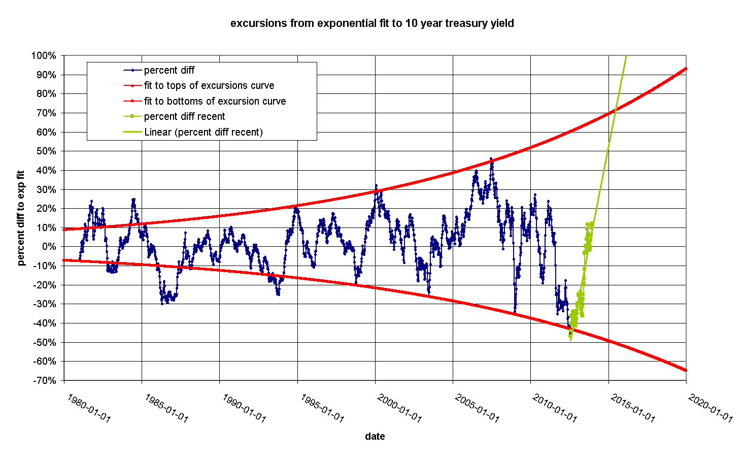
This is an exponential fit to the 10 year treasury yield since
1982. The red line is an exponential fit to the data and the green
lines are exponentials that pass through the maximum or minimum
points on the blue curve relative to the red line. Note that the
size of the excursions from the red line are increasing. This curve
quantifies the difference:
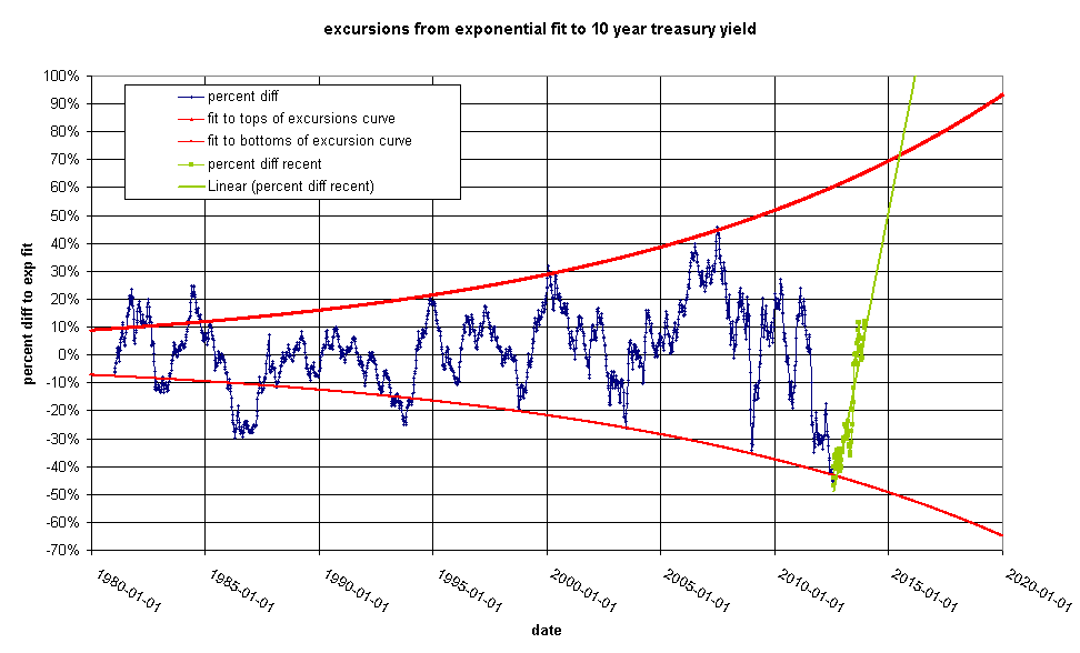
For purposes of argument, let's suppose that we see a 50% upswing
by 1-Jan-2015. This would be a value of 3.675%/year. Today this
doesn't look like a huge jump. We are looking at 3% on the nose as
of Friday 27-Dec-2013, but in fact due to the fact that the green
lines are converging, this is a dramatic departure from previous
behavior.