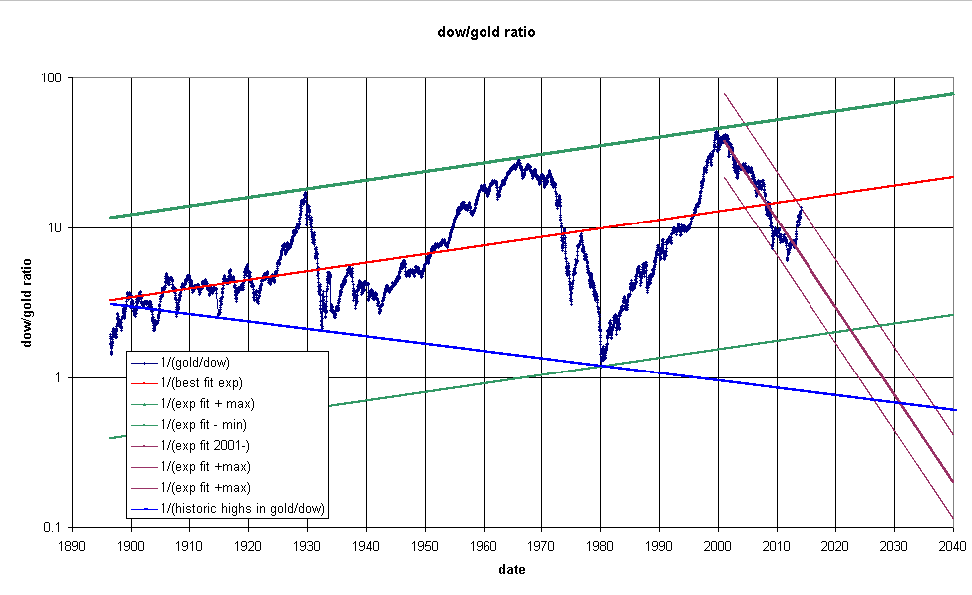
Following on from my post on 2014-1-1 entitled:
The Dow/Gold Ratio, I read the following article on
CaseyResaerch:
The Correction Isn't Over, But Gold's Headed to $20,000. In the
article, Professor Krassimir Petrov points out that it is possible
to draw a line from the low point in 1932 to the low point in 1980
on this chart
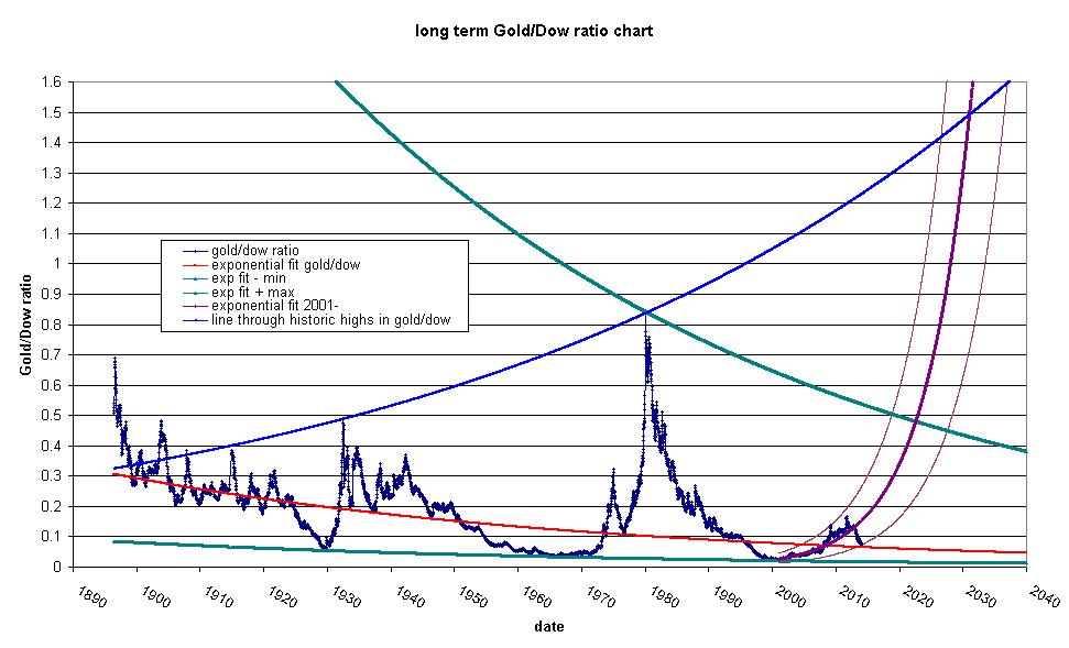
I have added his proposed line and extended out the exponential fits to recent data to an intersection in 2026 to 2037. I should point out that he says that technical analysis doesn't work with long term cycles. This chart has gained a lot of notoriety since James Turk promoted it in an article in Barron's some years ago. Let's look at the inverse of the chart, the Gold/Dow ratio:
