Inflation adjusted Dow
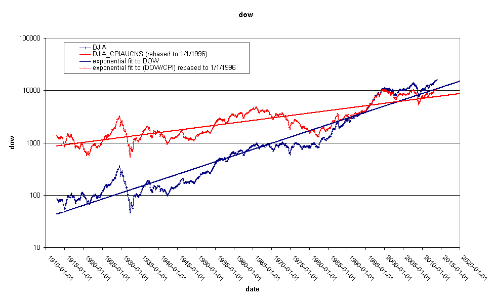
This is the inflation adjusted Dow:

Note that I am using the Dow not the S&P500 I used on
2014-01-26. This series is quite a bit longer than the previous
one. The longest Consumer Price Index record I can find dates back
to 1913. Both series are above their long term trend line. The
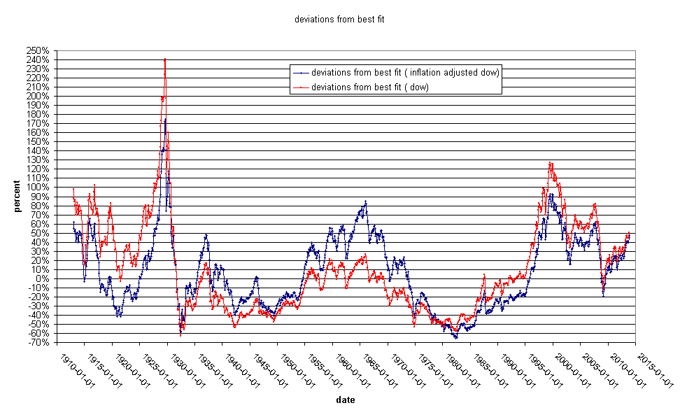
percentage above long term trend line is here:

The take home message here is that the Dow is overvalued relative
to things that people need to buy, such as food and energy. Not
surprisingly, commodities such as wheat and pork bellies are
reflecting this. The Dow is very high, but it has not hit it's
recent highs relative to it's long term trend line. interestingly,
it's rate of increase relative to the run up from 1995-2000 is much
slower. The thing that distinguishes a best fit line, is that the
data spend half of the time below the line and half above. We need
some serious below-the-line time to keep this line running
straight.

